Tabs
With Tabs we can have different layers of content in the same place, users can choose which layer they want to see. To use tabs, it is necessary to load the JavaScript file of FlatifyCSS, so without this file, you just have the component which does not work on click.
A simple tabs component
Each tabs component is wrapped with .tabs-wrapper (which is not necessary), there is a header and content area. Inside the header area buttons are represented, they have target tab panel selectors that are inside the content area.
Accessibility matters!
Try to apply guides for a perfect tab component, first read W3C Working Groups Notes about tabs. The code of the example above has done the things that you should do, for example, the active tab button will get aria-selected="true" automatically, you just need to determine the basics aria- HTML attributes.
<div class="tabs-wrapper">
  <div class="tabs-header" role="tablist">
    <button role="tab" class="tab-button active" aria-controls="panel-kafka" aria-selected="true">Kafka</button>
    <button role="tab" class="tab-button" aria-controls="panel-werther" aria-selected="false">Werther</button>
    <button
      role="tab"
      class="tab-button"
      aria-controls="panel-cicero"
      data-tab-target=".cicero-tab-panel"
      aria-selected="false"
    >
      Cicero
    </button>
  </div>
  <div class="tabs-content">
    <div id="panel-kafka" class="tab-panel show">1 ...</div>
    <div id="panel-werther" class="tab-panel">2 ...</div>
    <div id="panel-cicero" class="tab-panel cicero-tab-panel">3 ...</div>
  </div>
</div>
Determine the target panel
A tab button should determine the target tab panel that will be displayed when the tab button is clicked.
It can be defined with both data-tab-target and aria-controls HTML attributes.
Note that data-tab-target has more priority and it accepts any kind of selectors like data-tab-target=".my-panel" so you should determine if the selector is class or ID.
On the other hand, aria-controls="my-panel" is an HTML attribute for accessibility purposes it should have the ID of the target panel so it can be used to determine the target as well (when data-tab-target is not set).
Change line position
You can add .line-at-top class to the .tabs-header to change tab indicator line from bottom to top.
Centered tabs
By adding .flex-center class to the .tabs-header element, tabs will be center aligned.
Bordered tabs
It is also possible to have a bordered tabs component, add .bordered class to the .tabs-wrapper.
Scrollable tabs
All of a sudden you might have a lot of tabs and you do not want them to break into multiple lines, so you can add the .scrollable class to the .tabs-header, it will put the tabs in a scrollable container as long as the tabs are wider than the container.
Animations
Tabs by default has blow in/out animation, however you can add .slide-animation, .fade-animation, .no-animation to .tabs-content.
By the way, it is possible to use a brand new animation to show/hide tabs, you can use CSS variables — that are defined for this purpose — to create your gorgeous animation.
Predefined animations
.slide-animation
.fade-animation
.no-animation
Custom animations
To change current animations duration:
--flatify__tab-animation-show-duration
--flatify__tab-animation-hide-duration
Or set custom animations:
--flatify__tab-animation-show
--flatify__tab-animation-hide
Do not use none for animations!
Never use none for these kinds of animations, because FlatifyCSS JavaScript listens to animationend event, so if you set none there won't be an animation, it means animationend is not going to be triggered. If you want to disable an animation just set animation-duration to 0s.
The example could be:
.no-animation-accordion {
  --flatify__tab-animation-show: flatify-fade-in 0s;
  --flatify__tab-animation-hide: flatify-fade-out 0s;
}
Animations example
Check out the examples below to understand use cases:
HTML
The examples above has the same HTML for different types, the only point is that animation classes should be added to the .tabs-content element.
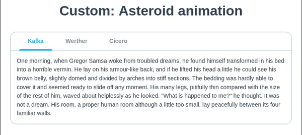
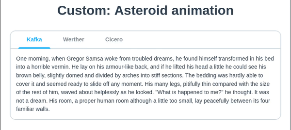
/* Asteroid animation */
@keyframes my-asteroid-anim-show {
    from {
            opacity: 0;
            transform: scale(3) rotate(180deg);
    }
    to {
            opacity: 1;
            transform: scale(1) rotate(0);
    }
}

.my-custom-asteroid-animation {
    --flatify__tab-animation-show: my-asteroid-anim-show 1s cubic-bezier(0.59, -0.39, 0.36, 1.38);
    --flatify__tab-animation-hide: flatify-fade-out 0s;
}

/* Y asix slide animation */
@keyframes my-slide-top-anim-show {
    from {
        opacity: 0;
        transform: translateY(-50%);
    }
    to {
        opacity: 1;
        transform: translateY(0);
    }
}

@keyframes my-slide-bottom-anim-hide {
    from {
        opacity: 1
        transform: translateY(0);
    }
    to {
        opacity: 0;
        transform: translateY(50%);
    }
}

.my-custom-slide-animation {
    --flatify__tab-animation-show: my-slide-top-anim-show 0.2s linear;
    --flatify__tab-animation-hide: my-slide-bottom-anim-hide 0.2s linear;
}
Animations for reduced motion users
Accessibility matters!
For reduced motion users, all animations will be fade in/out.
Sizes
To change tabs size use size setter classes.
These classes just set a font-size property so it is possible to change it yourself by writing custom CSS.
<div class="tabs-wrapper bordered size-xs">...</div>
<div class="tabs-wrapper bordered size-md">...</div>
<div class="tabs-wrapper bordered size-2x">...</div>
Colors
There are helper classes for styling elements like tabs, first read about color setter classes. Note that you should add classes to the .tabs-wrapper or .tabs-header and .tabs-content separately.
<div class="tabs-wrapper bordered style-dark">...</div>
<div class="tabs-wrapper bordered style-blue-light">...</div>
<div class="tabs-wrapper bordered style-pink">...</div>
Customization
FlatifyCSS has some CSS variables for customizing tabs, as we talked earlier about animations you can also change the colors of tabs with these variables.
--flatify__tab-txt-color
--flatify__tab-bg-color
--flatify__tab-border-color
--flatify__color-accent-primary (to customize active tab color)
and also animation CSS variables as we talked about them above:
--flatify__tab-animation-show-duration
--flatify__tab-animation-hide-duration
--flatify__tab-animation-show
--flatify__tab-animation-hide