Accessibility
FlatifyCSS respects accessibility. For documentation, attributes like aria- are included with examples and there is always a note for accessibilty.
Assistive technologies
Where content changes dynamically, for example when you open a modal, JavaScript automatically will change the necessary aria- HTML attribute and the screen reader will announce the changes.
Also, documentation gives a helpful overview of how to use the aria- attributes where it is needed.
Keyboard friendly
Users who prefer keyboard to navigate are important, so FlatifyCSS considers them and optimize :focus-visible for styles.
Reduced motion
Based on this article: "Vestibular disorders can cause your vestibular system to struggle to make sense of what is happening, resulting in loss of balance and vertigo, migraines, nausea, and hearing loss. Anyone who has spun around too quickly is familiar with a confused vestibular system."
As web developers, we should consider this and define or reset current animation and transitions with limited movement.
In favor of prefers-reduced-motion media feature, it is possible to know if the user wants reduced motion or not.
FlatifyCSS takes these facts over, inside a11y.scss file these rules are applied:
Background
Depends on web.dev article:
"There are decorative effects like animated gradients, parallax scrolling, background videos, and several others. While many users enjoy such animations, some users dislike them because they feel distracted or slowed down by them. In the worst case, users may even suffer from motion sickness as if it were a real life experience, so for these users reducing animations is a medical necessity."
We fix the issue with: background-attachment: initial;
Transitions
No transition is necessary for reduced motion so we reset FlatifyCSS defined transitions duration to 0:
-flatify__simple-transition
-flatify__long-transition
-flatify__bouncing-transition
Animations
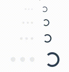
We use flatify-fade-in, flatify-fade-in-out and flatify-fade-out animations instead of primary, also it is a good practice to limit animation steps for complex animations like what we do for spinner loadings:
Visual disabilities
The palette is wide enough to handle basic functionalities, it is up to you to consider using the best practices for color-blind users while designing.
Color blindness simulation
The Mozilla Firefox browser has a great accessibility panel that simulates diffrent types of color blindness, you can easily check contrast issues and fix them besides other helpful tools like keyboard and text labels checker.
High contrast
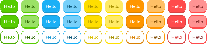
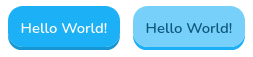
FlatifyCSS colors contrast is not scored 100% you can create a special version for people with contrast loss issues (high contrast) by tweaking some percents. For example, here is the blue color variables inside _config.scss file:
$BLUE: #1cb0f6;
$BLUE_LIGHT: tint($BLUE, 40%);
$BLUE_DARK: shade($BLUE, 15%);
$BLUE_DARKER: shade($BLUE, 50%);
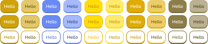
And what is looks like:
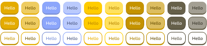
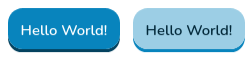
First with Coolors, find the base color shades then choose the darker shade of it and increase the shade() and tint() value as percent.
$BLUE: #0884bd;
$BLUE_LIGHT: tint($BLUE, 60%);
$BLUE_DARK: shade($BLUE, 50%);
$BLUE_DARKER: shade($BLUE, 70%);
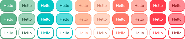
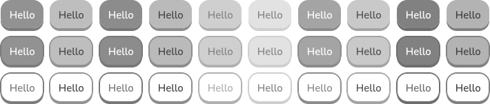
The result will be:
Anchors
By default FlatifyCSS anchors and link buttons do not have borders because of designerish reasons, but if your audience is specific or you want to have a more accessible website you can change anchors basic styles with the _config.scss file.
Default styles for anchors are these:
// color
$LINK_COLOR: $ACCENT_COLOR;
$LINK_COLOR_HOVER: $ACCENT_COLOR_LIGHT;
$LINK_COLOR_FOCUS: $ACCENT_COLOR_DARK;
// text-decoration
$LINK_DECORATION: none;
$LINK_DECORATION_HOVER: underline 0.125em currentColor;
$LINK_DECORATION_FOCUS: none;
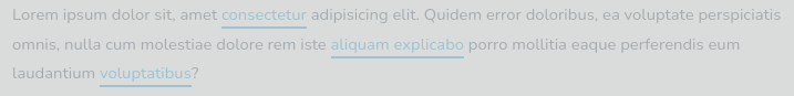
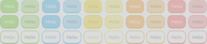
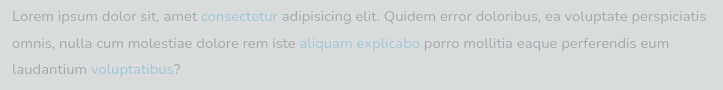
A typical link for a user with the contrast loss issue will be hard to find:
Nonetheless, we can customize links color and text-decoration to be more accessible:
// color
$LINK_COLOR: $ACCENT_COLOR_DARK;
$LINK_COLOR_HOVER: $ACCENT_COLOR;
$LINK_COLOR_FOCUS: $ACCENT_COLOR_LIGHT;
// text-decoration
$LINK_DECORATION: underline 0.125em currentColor;
$LINK_DECORATION_HOVER: underline 0.125em currentColor;
$LINK_DECORATION_FOCUS: underline 0.125em currentColor;
The result is: